
Your brand will never gain TikTok celebrity status with infographics, photography, illustrations, and other image-centric content. But that’s no reason to ignore these workhorse formats.
Visual assets can convey detailed insights and deep emotions in memorable ways and work well online or offline. Best of all, audiences don’t need to wait (impatiently) for a random pre-roll ad before viewing them.
Can this kind of content drive your marketing goals as well as video does? Absolutely — if you make wise choices in creating and executing it.
To illustrate the possibilities, I compiled examples, lessons, and tips from the winners and finalists of the 2024 Content Marketing Awards (CMAs).
1. Align visual creation with strategic goals
As with any content, you need a compelling rationale for visual storytelling and a clear plan for turning views into meaningful results.
Gentle reminder: Sharing a branded graphic or campaign photo online and waiting for the business offers to start rolling in is not a strategy. Neither is hinging your visual content success on creating the next viral phenomenon.
Before your creative team sketches their ideas, make sure they know the answers to these questions:
- Strategic fit: What are we trying to accomplish with our visual content? What content type(s) best fits this goal?
- Audience appeal: Who’s the target audience? What kinds of imagery draw their interest? How will we make this content accessible to them?
- Messaging focus: What problems does our organization solve? How might we best convey this visually?
- Branding: What makes our brand distinct? How can we communicate these attributes consistently and compellingly?
- Discoverability: What metadata must visuals contain so they’re accurately indexed by search engines?
- Measurement: What metrics will gauge success?
Ally Financial: Your Money Personality
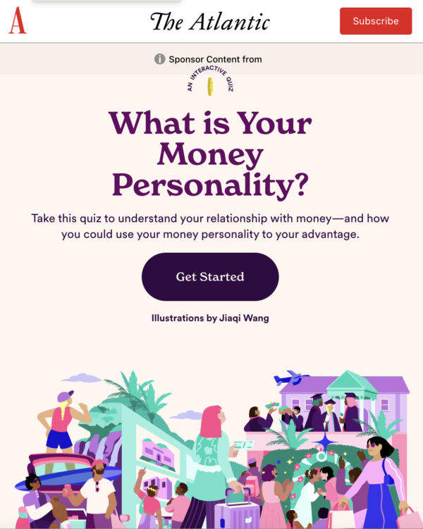
Fiscal health isn’t only about how much money you have — it’s also about how you spend it. While consumers expect their life goals to factor into this equation, they may overlook how their emotional relationship with money can affect their financial well-being.
Ally Financial considered that connection in the content strategy behind Your Money Personality, a branded content initiative with its media partner, The Atlantic.
A colorful interactive quiz acts as the core visual asset, helping consumers discover their financial personality and how to use it to their advantage.
A still image captured from the animated opening graphic (above) illustrates representations of the three financial priorities explored in the quiz:
- An airplane and a woman rolling a suitcase for the planning-a-vacation path
- A couple pointing to a home on a real estate listing on a wall for the buying-a-home path
- Graduates throwing a mortarboard in the air, a wedding celebration, and a luxury boat for the managing-debt path
The illustration style and thematic imagery carry through the quiz experience. It’s a clever design choice and symbolic of the lesson of strategic alignment. So, it’s not surprising that this project won Best Use of Interactive Content in the 2024 Content Marketing Awards.
After answering each question, the quiz taker sees tailored saving and investment recommendations for their paths from Jack Howard, head of money wellness at Ally.
2. Tell a complete brand story
Successful visual storytelling isn’t just about the pictures. It’s also about communicating clearly and consistently across all touchpoints of your brand’s experience. Whether a standalone infographic or a series of related images, it should contain a narrative thread your audience can follow through all stages of the buyer’s journey.
The threads also must maintain your brand identity, such as corporate colors and logos, but these aren’t the only factors.
Your content assets should also have a consistent look and design that viewers can instantly recognize and associate with your business, no matter where the content appears or what media format(s) you use.
Manitowoc Ice: Ice as Champion
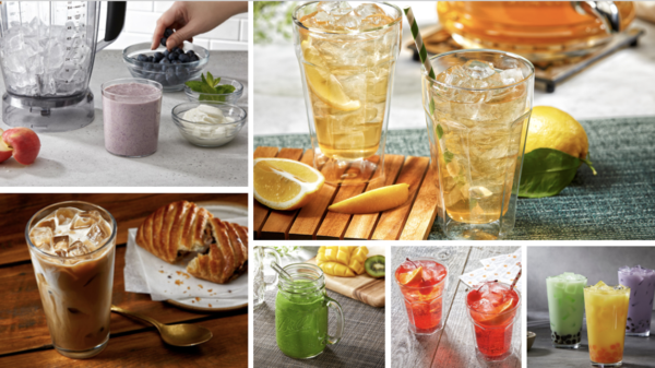
Manitowoc Ice, from Pentair Water Solutions, manufactures premium ice machines for a B2B client base of distributors, food service equipment dealers and service techs, and facility owners and operators.
Recognizing that machines are neither glamorous nor top of mind for these audiences, the brand showcases the high-quality products (different kinds of ice) the machines make.
Ice as Champion visually portrays the brand’s story of value through the art form of mixology: Manitowoc’s products enable customers to deliver elevated social dining and beverage experiences.
The elegant photography and art direction (shown in the collage above, which Manitowoc submitted as part of its award entry) allow the brand’s premium ice and water to shine — and earned it a finalist mention for Best Use of Photography in the 2024 Content Marketing Awards.
The photos show a careful selection of:
- Ingredients (yogurt and fresh fruit about to be added to a blender filled with ice) and garnishes (fresh-cut citrus sitting aside two glasses of iced tea)
- Food-pairing suggestions (an iced coffee beverage served with a flaky pastry)
- Glassware (a kiwi and mango smoothie served in a mason jar-like mug with a glass straw)
This painstakingly cultivated imagery also helps the brand communicate its visual story consistently across multiple marketing touchpoints, including its website, social media posts, digital brochures, and tradeshow monitors.
3. Enable dynamic, personalized engagement
Image-centric content doesn’t have to be a static, spectator-only experience. Animations and interactive features make your visuals more engaging. Incorporating personalization elements enhances the relevance and relatability of your key messages.
Rubrik Zero Labs: The State of Data Security
The field of cybersecurity relies on access to timely insights on current and emerging data threats. Yet, those often highly technical insights make it challenging for global organizations to understand.
Rubrik Zero Labs developed a series of interactive research reports to guide its clients through complex data and concepts. Each edition of The State of Data Security report pairs a choose-your-own-adventure structure with animated visuals that immerse and engage readers.
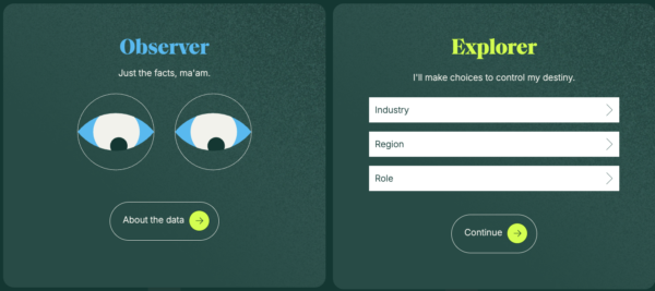
For example, to access the winter report (as shown in the screenshot above), visitors can choose either:
- The Observer option on the left (tagline “Just the facts, ma’am” over a set of moving eye-shaped graphics) to go straight to the research data.
- The Explorer option on the right (tagline “I’ll make choices to control my destiny” over three customization fields: Industry, Region, and Role).
Both selections lead to vibrant visual storytelling that reflects the dynamic nature of the subject matter.
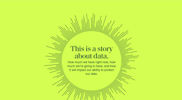
As viewers scroll through the report, motion graphics illustrate key takeaways and contextualize the insights.
For example, this screen grab from the interactive page shows a simple block of text (centered on a neon yellow-green background), which reads: “This is a story about data. How much we have right now, how much we’re going to have, and how it will impact our ability to protect our data.”
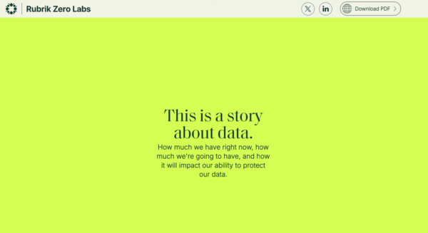
As the viewer scrolls, a ring representing data encircles the words and develops into the starburst effect shown below.
Rubrik Zero Labs also offers a bonus option (a PDF version of the report) for those who prefer a linear storytelling experience. The project won Best Use of Illustration in the 2024 Content Marketing Awards.
4. Follow effective design and user experience principles
Many DIY design resources are available online, including stock image marketplaces, customizable design templates, and generative AI image tools.
While these tools allow almost anyone to produce visual content, they’re no substitute for design skills that ensure the resulting images are clear, readable, and consistently communicate your value proposition.
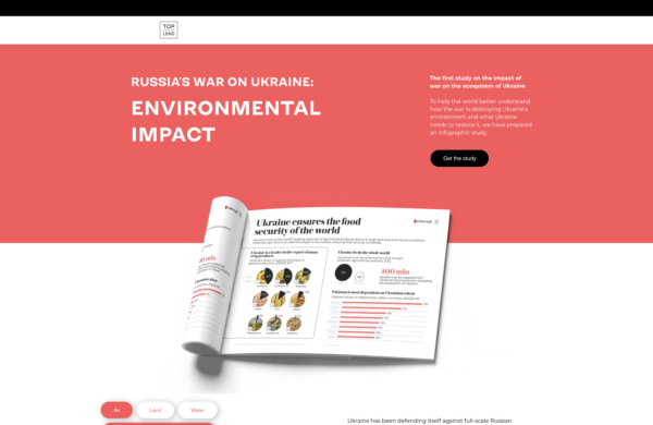
Top Lead: Russia-Ukraine War Environmental Impact
This project involved the work of skilled designers, from the compelling interactive landing page shown in the image above to the thoughtful infographics that make up this gated report.
The war in Ukraine has had a devastating effect on the people who live there. It also has had a profound environmental impact, including increased carbon dioxide (CO2) emissions and the threat of extinction for over 300 species of plants and animals. These implications haven’t received much attention in the media.
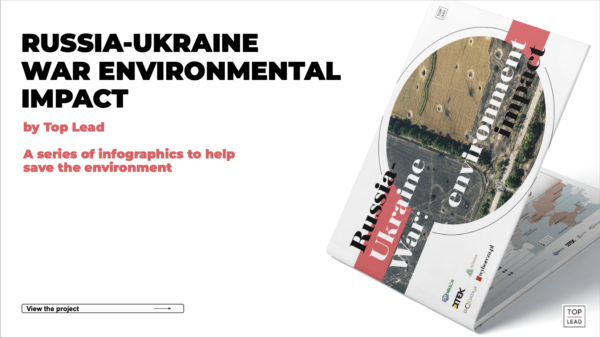
To raise awareness among non-Ukrainian journalists, politicians, and others who can help support and fund restorative efforts, Top Lead produced Russia-Ukraine War Environmental Impact, a comprehensive book of research (cover shown above) illustrated through infographics.
Top Lead designed the report to ensure all audiences would understand the message.
The awards entry Top Lead submitted explains how the report integrates real photos and satellite images to show the consequences of war in an emotionally resonant way.
The designers used a minimalistic layout and simple visual shapes to convey detailed information quickly. A muted, earth-toned color palette expresses deference to the sensitive topic. And font choices guide the reader: Serif fonts highlight key takeaways, while sans-serif fonts enhance the readability of longer sections.
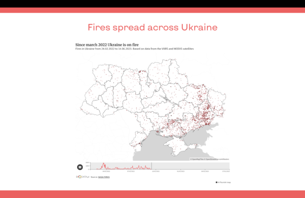
Data-enhanced maps carefully highlight pertinent details. For example, the simple map of Ukraine (the outline of the country and the regions it encompasses) fills with red dots representing fires that occurred between February 2022 and June 2023.
The report’s imagery clarifies the extent of the problem, the critical need for intervention, and how stakeholders can contribute.
Top Lead earned two mentions in the 2024 Content Marketing Awards for this work: Finalist for Best Infographic Series and Winner for Best Special Topic Issue (in the content creation category).
5. Tailor visuals to the delivery platform
When planning how your visual story will unfold across touchpoints, consider how each sharing environment affects the audience’s experience. For instance, detailed graphics work well on a static website but might be hard to understand in a fast-moving video.
To determine how well your creative fits distribution contexts, gather relevant audience insights, including their platform interests and engagement preferences. Then, tailor your delivery to the unique conditions of each environment.
Advil: Head Settings
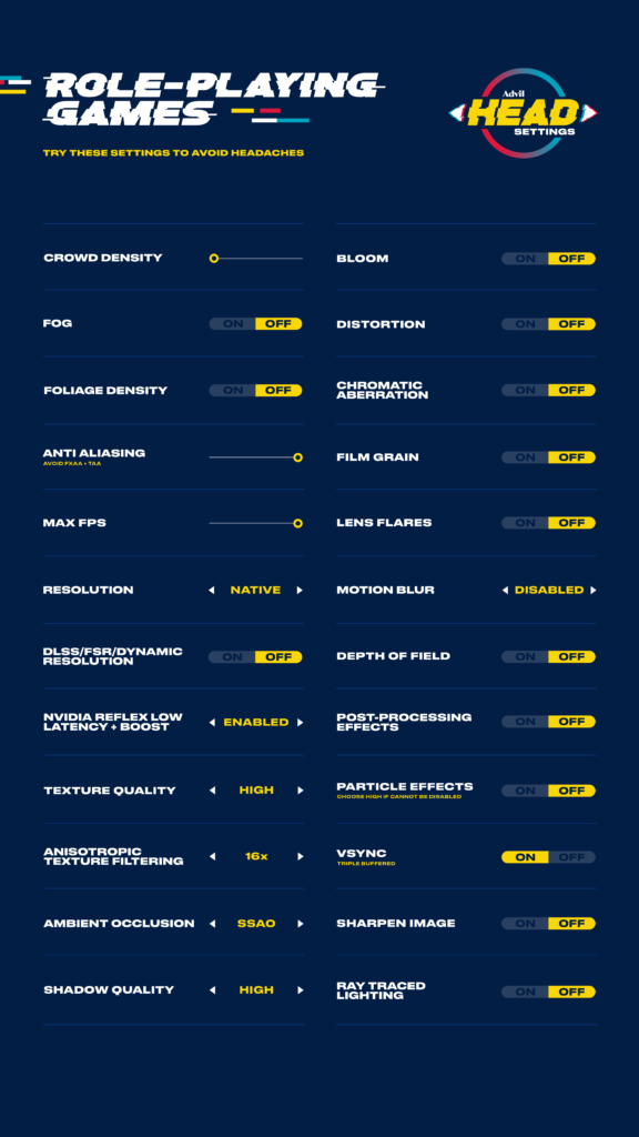
Gamers may spend hours staring at their screens. Even under the best lighting conditions, in-game effects such as strobing, distortion, motion blur, and screen shaking can lead to eye strain and painful headaches.
To reduce the detrimental effects of the most common triggers, Advil Canada partnered with cognitive scientists to develop Head Settings, a content hub with a series of genre-specific guidelines for optimal gameplay.
The visual checklists indicate configurations that heighten comfort without detracting from the playing experience. For example, turning off headache-inducing effects like motion blur, lens flares, fog, and distortion while dialing up texture quality, anti-aliasing, and max FPS are among the recommended settings in the checklist for role-playing games (shown above).
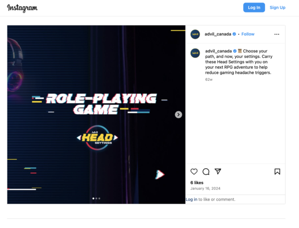
To optimize awareness (and adoption) of Advil’s scientifically tested recommendations, the brand promoted the checklists across gamer-friendly social sites, including YouTube, TikTok, Instagram, and Twitch. The team fine-tuned the creative approach to fit each platform’s conversational characteristics.
For example, Advil shared the visual checklists as a multi-image carousel people could scroll through on Instagram.
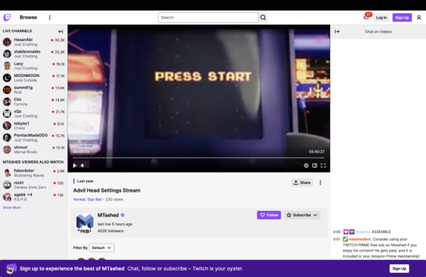
However, for Twitch, the brand partnered with gaming influencers who demoed the settings during real-time live gaming experiences.
Head Settings earned four mentions in the 2024 Content Marketing Awards: Best Use of Research (winner), Best Content Marketing Program in Healthcare (finalist), Best Use of Influencer Marketing (finalist), and Best B2C Branded Content Campaign (finalist).
6. Don’t be afraid to get emotional
Some of the most memorable content campaigns tap into the power of emotion. Need proof? Watch this winning video from Purdue University. I defy you to fight the feels that stem from the inspirational display of fatherly love and encouragement.
Yet even static photography can move your audience in meaningful ways. The key is to build a memorable connection between the imagery and your brand’s offerings.
Sokos: Box of Emotions
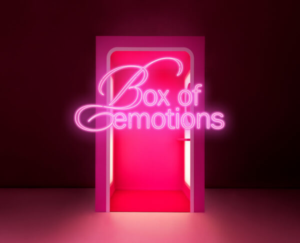
Beauty may be in the eye of the beholder, but it’s also an emotion-laden expression of self-identity. To enhance its reputation as a shopping destination and a beauty brand Gen Z consumers can trust, Finnish department store Sokos developed a visual-forward initiative to promote its Sokos Emotion branded products: Box of Emotions.
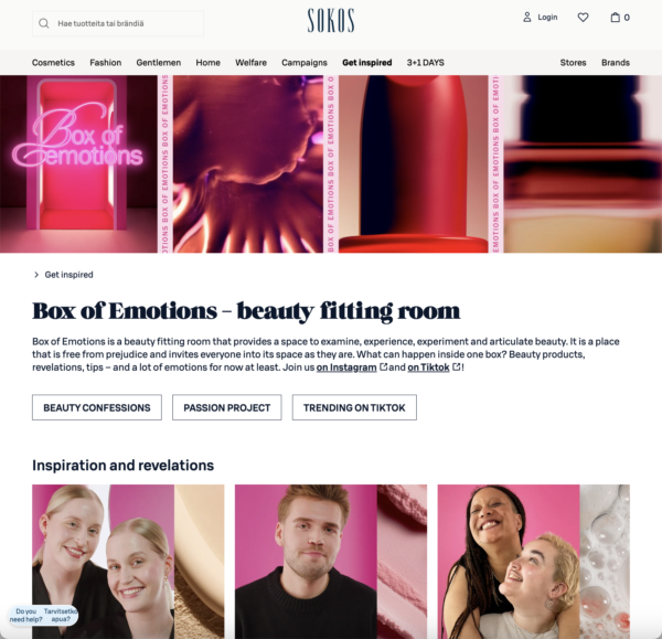
This screenshot (above) of the campaign’s home on the Sokos website shows the namesake box (a physical “fitting room” for beauty products) and images of beauty products in shades of pink and red.
Clickable buttons direct visitors to three options: Beauty Confessions, Passion Project, and Trending on TikTok. Images of the beauty influencers who have visited the Box of Emotions appear below the heading “Inspiration and revelation.”
When clicked, the still images on the site page link to YouTube clips that share the influencers’ guidance for viewers on using Sokos Emotion beauty products to look their best. (To view the site content translated from its native Finnish, click “English” when the site opens.) These videos were also shared on the brand’s Instagram page.
But the brand also dove deeper into the topic’s emotionality. Many of the videos, filmed in what the brand calls the “judgment-free space,” feature vulnerable confessions about the influencers’ own beauty experiences. Playing off the brand’s pink box logo, the pink beauty fitting room (shown above) made an ideal backdrop for the conversations.
In addition, it repurposed videos and still photos captured for a visually stunning project case study. This entry helped the project win Best Paid Advertising/Content Marketing Integration and earn a finalist nod for Best Content Marketing Launch in the 2024 Content Marketing Awards.
The brand also noted it plans to feature the box at future events, extending the emotional connections it forged with the original campaign.
How do you visualize your brand’s story?
Of course, these ideas are just the tip of the visual content iceberg. With a creative vision and a clear strategy to support it, your visual content will speak volumes about your brand.
Updated from a March 2022 article
Cover image by Joseph Kalinowski/Content Marketing Institute
